Are These 7 UI Interface Design Flaws Killing Your Sales?
Most business owners spend a lot of time and money getting people to visit their website. They invest in ads and social media, but often forget what happens once a user actually arrives. If your ui interface design is frustrating or confusing, those visitors will leave without buying anything. Good design is not just about pretty colors. It is about making it easy for people to give you their money.
At Waince Web Tech, we see many brands struggling with high bounce rates simply because their website layout is working against them. If you want to turn things around, you should consider partnering with a professional website designing company to ensure your site is built for conversions.
Let’s look at seven common design flaws that might be quietly hurting your bottom line.
1. Confusing Navigation Menus
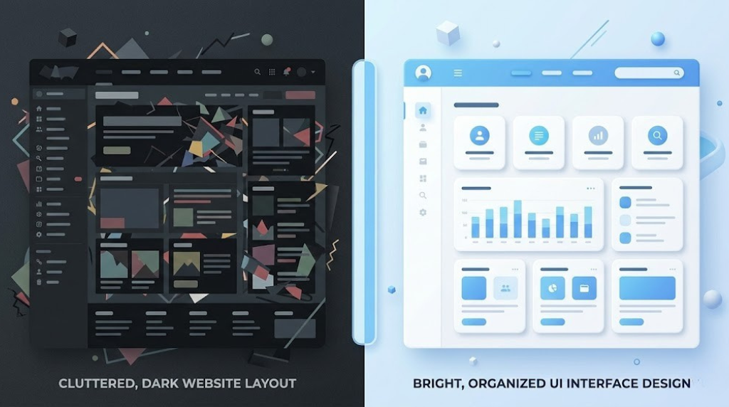
When a person lands on your site, they want to find information quickly. If your menu is hidden, uses strange labels, or has too many levels, users will feel overwhelmed. A clean interface should guide the user. If they have to think too hard about where to click next, they will likely click the back button instead.
2. Buttons That Do Not Look Like Buttons
This is a common issue in modern web design. In an effort to look minimal, some designers make buttons look like plain text or flat shapes that do not stand out. Your “Buy Now” or “Contact Us” buttons need to be obvious. Use contrasting colors and clear shapes so the user knows exactly where to click to take action.
3. Ignoring Mobile Users
Most online shopping and browsing now happens on smartphones. If your ui interface design is not responsive, it will look broken on a small screen. Text might be too small to read, or buttons might be too close together to tap. Google also penalizes sites that are not mobile-friendly, which means less traffic and fewer sales.
4. Slow Loading Visuals
Modern users are impatient. If your high-quality images and animations are not optimized, your page will load slowly. Using tools like Figma or Adobe Express to export web-ready assets is essential. Even a one-second delay in page load time can lead to a significant drop in conversions. Always use modern formats like WebP to keep things fast.
5. Lack of Whitespace
Some business owners try to cram as much information as possible onto the screen. This creates a cluttered environment that feels stressful. Whitespace, or negative space, allows the user’s eyes to rest and focus on what is important. A clean layout makes your product or service feel more premium and trustworthy.
6. Poor Color Contrast and Accessibility
If your text is light gray on a white background, many people will struggle to read it. Accessibility is a huge part of modern design. Ensuring your site works for everyone, including those with visual impairments, is not just a nice thing to do, it is a business necessity. You can learn more about these standards through the W3C Accessibility Guidelines to make sure your site is inclusive.
7. Inconsistent Design Elements
Consistency builds trust. If your fonts, button styles, and color palettes change from one page to the next, your website feels unprofessional. A solid ui interface design uses a consistent visual language. This makes the user feel safe and confident as they move through your sales funnel.
The Bottom Line
Your website is your digital storefront. If the door is stuck or the aisles are messy, people will shop elsewhere. By fixing these common UI flaws, you can create a smoother experience that encourages visitors to stay longer and buy more. Focus on clarity, speed, and mobile usability to see a real difference in your sales numbers. If you are ready to upgrade your digital presence, start by evaluating how your current design serves your customers.